PACKAGING
Health Basics
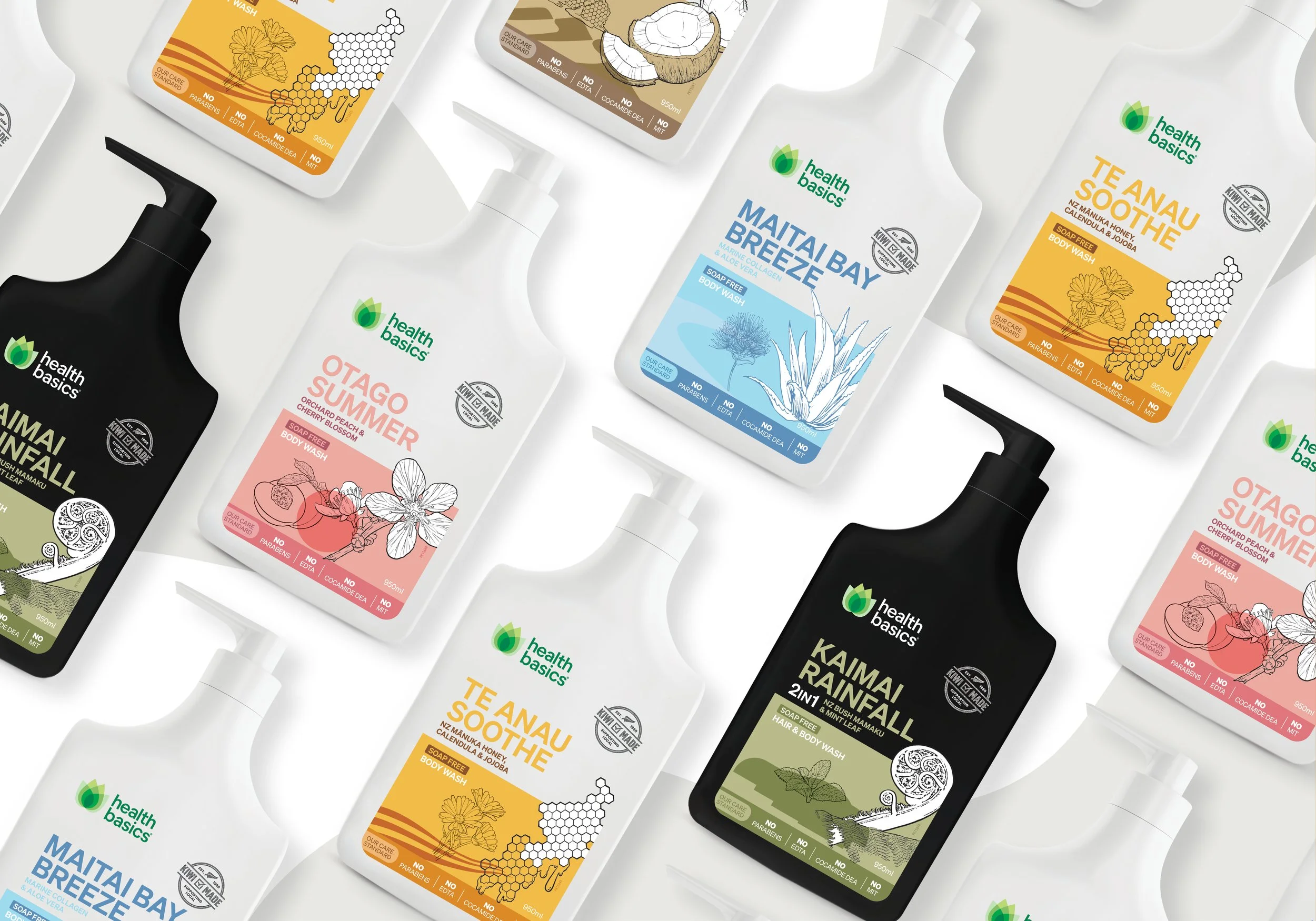
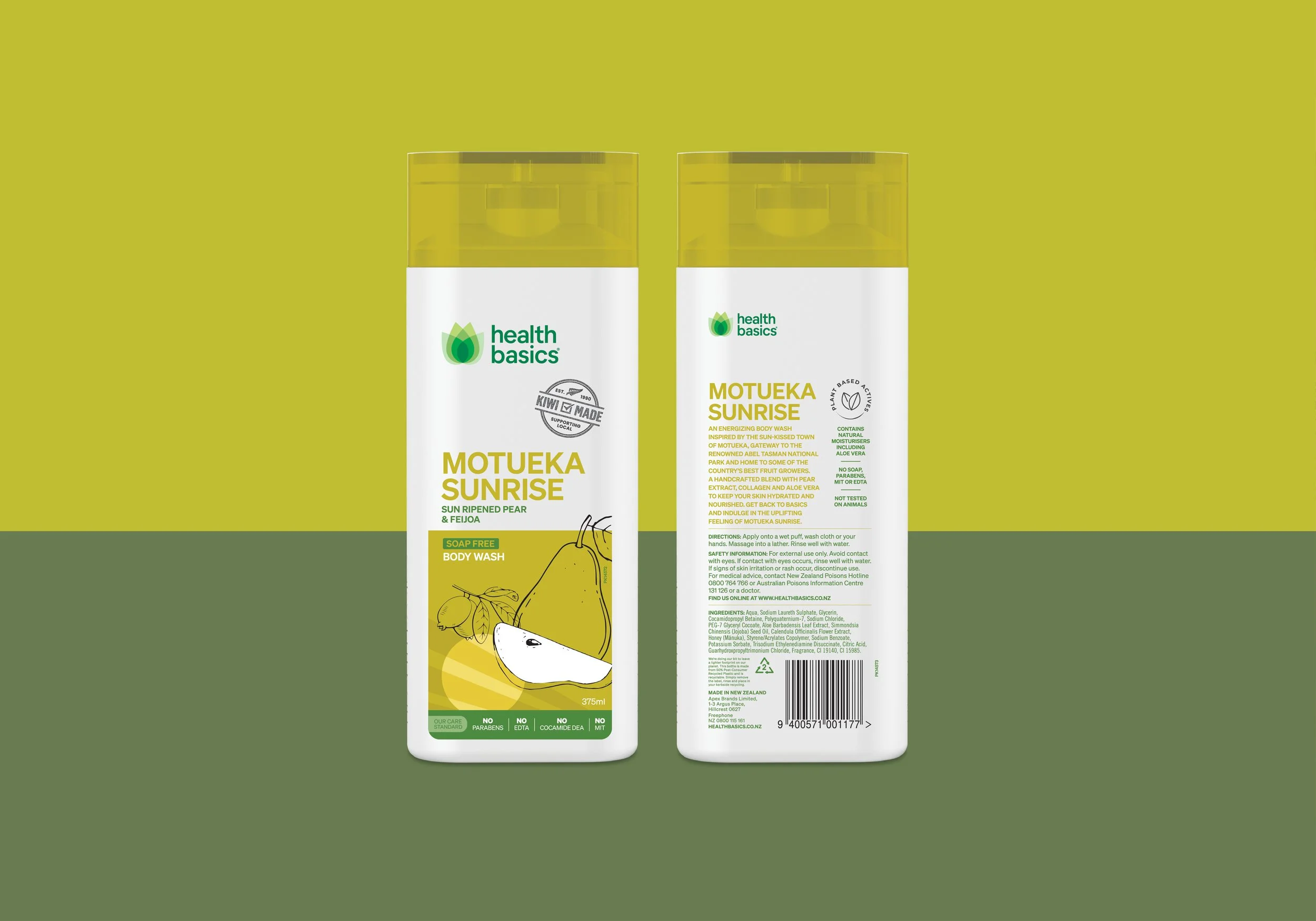
Health Basics are a low cost brand, but still need to appear above the budget ranges. So when it came time for an update to the labelling on their body wash provenance range, we chose to focus heavily on the botanicals within the formulation. Creating illustrations and a colour palette that complimented each product but still worked across the range meant that, when combine with clean, clear typography, the result was a basic, yet visually appealing line up.
Client /
Apex Brands
Sector /
FMCG
Our role /
Design, art direction, artworking, image retouching
Location /
New Zealand & Australia